

E-commerce associate
AW Chang Corporation
AW Chang Corporation is a New York City-based menswear house managing a portfolio of 5 brands across formal and casual categories. As their sole e-commerce associate in a lean environment, I owned end-to-end site operations, platform migrations, and cross-functional execution across merchandising, marketing, design, and development.
Brooklyn Brigade — Shopify Migration & Storefront Rebuild
Inherited a legacy Magento storefront and led the end-to-end migration to Shopify across a 5–6 month timeline — encompassing data migration, asset refresh, promo code transfer, and a full UX wireframe rebuild. Served as the primary bridge between internal stakeholders and a third-party full-stack development team, translating business requirements into actionable design specs across PDP, PLP, global nav, and homepage.
Phase 1: Audit & Discovery
Conducted a full inventory of existing Magento site architecture including product data, digital assets, promo codes, and collection structure. Identified UX gaps in filtering, navigation, and product page layout ahead of migration planning.
Phase 2: Wireframe & UX Design
Built homepage wireframe and translated global nav designs into InDesign/Figma mockups for dev team handoff. Defined filter logic redesign, PLP layout updates, and PDP content hierarchy to improve product discoverability across 3,000+ SKUs. Communicated design intent through annotated mockups, participated in QA reviews across PDP, PLP, and homepage, and flagged discrepancies between wireframe specs and live builds.
Phase 3: Content & Asset Migration
Coordinated transfer of all product data, imagery, promo codes, and collection taxonomy from Magento to Shopify. Refreshed digital assets in parallel to ensure the new storefront launched with updated visuals — not legacy content in a new shell, but built on top of same codebase to keep operational integrity of previous dev work.
Phase 4: Dev Team Collaboration QA
Partnered with third-party full-stack dev team on API integration setup and theme implementation. Finalized all assets, product data, and LP designs. Conducted final UAT phase with internal stakeholders before go live.
Phase 5: Launch
Coordinated go-live across internal stakeholders and external dev partners. Ensured all collections, filters, promo codes, and redirects were accurate and functioning at launch.
Responsibilities Breakdown:
| E-commerce Associte (internal) | Dev Team (External) |
| Wireframe & Figma mockups | API integration & theme build |
| PDP/PLP/filter design specs | Front-end implementation |
| Asset & data migration | Technical fixes |
| Stakeholder coordination | QA |
| Launch readiness oversight | Deployment |
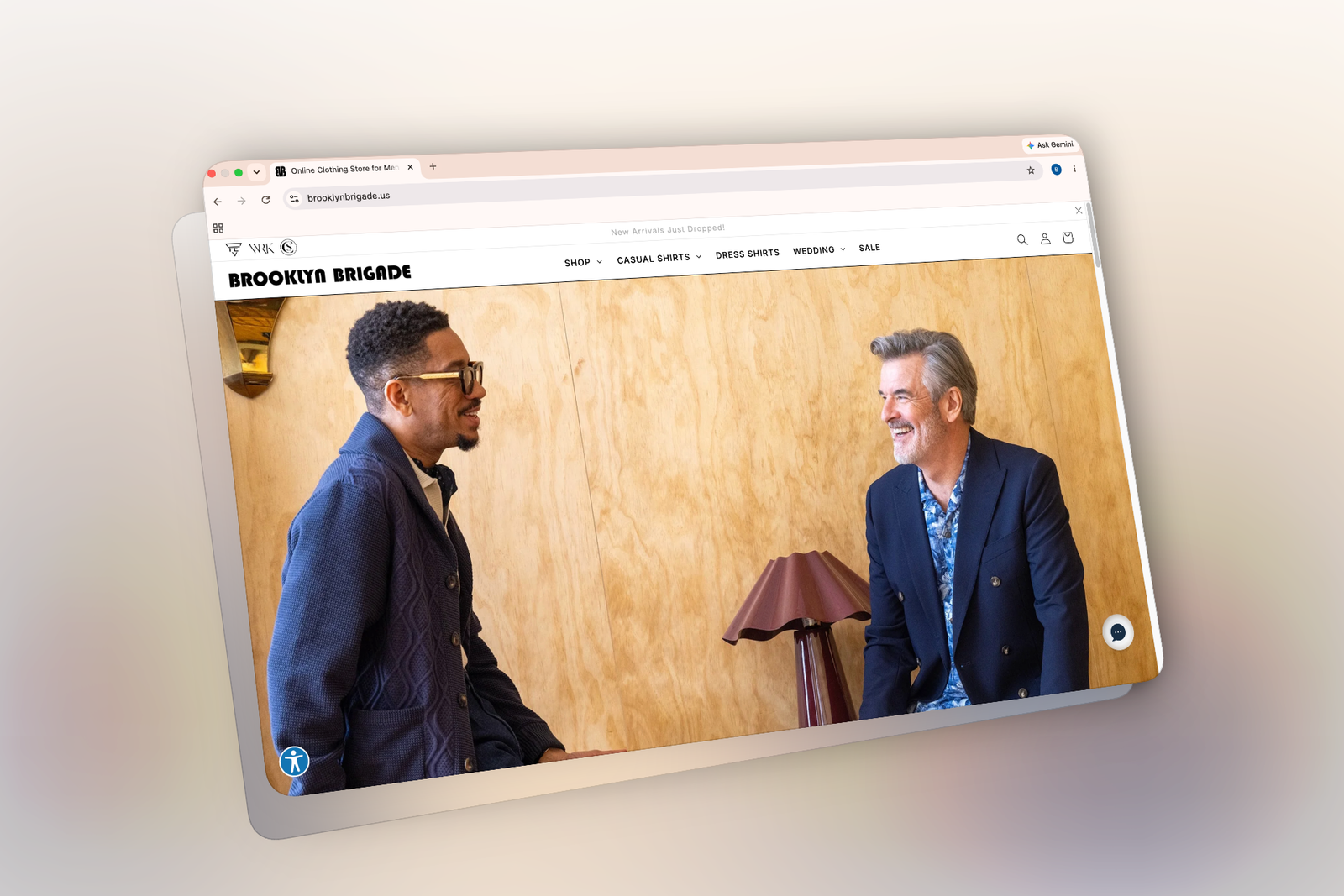
Magneto to Shopify Migration (Homepage Revamp)
The original Magento homepage (left) had limited merchandising flexibility, a cluttered nav, and a static hero that made it difficult to surface new arrivals and seasonal priorities. The result (right): a leaner, more conversion-focused storefront was built to support an ongoing seasonal launch cadence.

Old to New Global Navigation (Magento)
Images (1-2): showcases the old Magento site where the global nav was cluttered with collections we were getting rid of and moving to off price sellers.
Images (3-4): showcases the new Shopify site where the global nav went through a facelift with internally aligned taxonomy that was also tied to retroactive styles and upcoming seasonal launches for the collection.


Old to New Collection Containers (Homepage)
The old collection containers (left) relied on a cramped three-column grid with inconsistent imagery that undermined the brand’s positioning. The redesigned layout (right) shifts to larger, editorial-style imagery with clean category labels — giving the homepage a more intentional, boutique feel that better reflects the Brooklyn Brigade customer.


Old to New Carasoul Section (Homepage)
The old carasoul section (on the left) had outdated assets along with lack of positoning consistency that created a messier look and feel overall to the UI. The redesigned layout (on the right) required coordination with marketing/creative teams to curate consistent flat lay images for the first image, along with working with the front-end dev team for “New” Arrivals badges. Fabric swatches on the bottom were also incorporated to show the customer our various color variant offerings.


Old to New Filter Layout & Taxonomy
The old filter options (on the left) carried old taxonomy and color variant identifiers, along with presenting a less cohesive UI look overall for the customer that felt a bit outdated. The redesigned layout (on the right) matches the font hierarchy structure along with the new taxonomy compliant with the design and product team to showcase a cleaner and more organized experience for the customer when filtering to their desired option.


PLP & PDP Redesign
The PLP redesign shifted from a front-facing model grid requiring a “Quick View” click to see fabric detail, to a hover-reveal swatch layout — a small but meaningful UX improvement for a brand with intricate print designs. Assets were also re-shot pre-migration to include a flat lay for every style, giving customers a cleaner view of fabric and pattern before adding to cart.


The PDP redesign also had a large facelift where we wanted to change up the UI with square elements rather than circular from the fabric swatches down to the sizing options. Coordination with the dev team was crucial here so we were aligned on the final vision.
Image 4: the mobile configuration was heavily considered here as well, where before the UI felt really cluttered with a lot of the pop-up notifications we had available for the customer. Image 7: showcases the cleaned-up UI for mobile to fit into the desired design look to match the desktop version.


Old to New Add to Cart Page
The add to cart section also needed a serious redesign starting with moving a lot of the elements to the top of page so the customer has less to scroll or maneuver before converting. The payment options were also expanded and showcased top of page to give the customer the option to pay now or enroll in BNPL options. (Image 3 “old” and 5 “new”): Mobile breakpoints were also factored in to maintain the same clean UI elements implemented for desktop.


